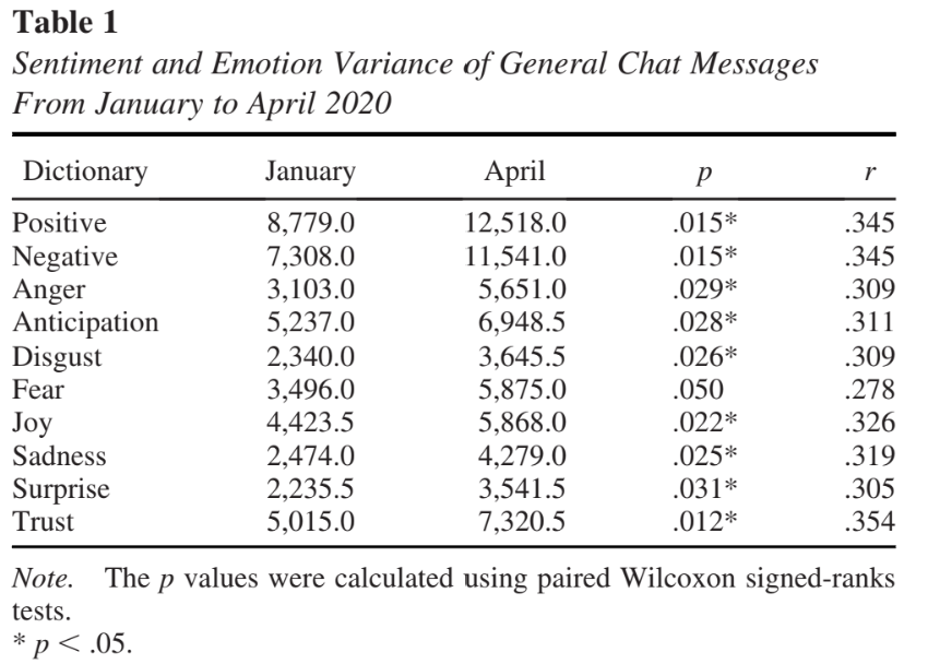
14 Visualizations
14.1 Introduction
The Imperative of Visual Representations in Research
Data visualization serves as a crucial tool in media and information studies, designed to transform complex data sets into a visually engaging format that enhances comprehension and facilitates insights. The visual representation helps in making sense of large amounts of data, which might be impenetrable in raw form.
In the contemporary landscape of academic and applied research, visual representations have risen to prominence as indispensable components of scholarly communication. Visual aids such as tables, graphs, and charts play a critical role in the dissemination of research findings, serving as a potent mechanism for encapsulating complex datasets, theories, and relationships in an accessible manner (Tufte, 2001). In fact, well-designed visualizations can make a marked difference in how research is consumed, interpreted, and critiqued.
Facilitating Cognitive Processing
Humans are inherently visual creatures. A considerable proportion of the brain is devoted to visual processing, making visual cues one of the most effective means of information transmission (Ware, 2012). When integrated into research papers, visualizations capitalize on this cognitive predisposition, facilitating quicker comprehension and more robust retention of the material presented. This is particularly pertinent in fields like Communication and Media Research Methods, where data are often multifaceted and conclusions nuanced.
Enhancing Analytical Rigor
Visual representations also contribute to the analytical rigor of research endeavors. For instance, a well-plotted graph can illuminate trends and anomalies that may remain obfuscated in raw, numerical data (Cairo, 2016). As such, visualizations can serve as both a diagnostic tool for the researcher and an evidentiary asset for the reader, substantiating claims and underpinning arguments.
Complementing Textual Explanations for a Holistic Understanding
While the textual component of a research paper provides the requisite detail and contextual underpinning, it may fall short in offering the immediacy and clarity that visual aids can deliver.
Symbiosis of Text and Visuals
A synergetic relationship between text and visuals often proves to be the most effective approach for conveying a multi-layered research narrative. Textual explanations can delve into the intricacies, limitations, and theoretical frameworks that underlie the research, while accompanying visual aids provide an immediate, intuitive grasp of key points, trends, and implications (Kelleher & Wagener, 2011).
Accessibility and Engagement
Furthermore, well-crafted visualizations make scholarly work more accessible to a broader audience, including those who may lack specialized training in the subject area. They can break down barriers of jargon and complexity, transforming abstract concepts into tangible insights (Börner, 2015). In an educational context, this dual modality of presentation—textual and visual—appeals to varied learning styles, fostering greater student engagement and comprehension.
In summary, the role of visual representations in research is not merely supplementary; it is integral. Visual aids deepen our understanding of data, enhance analytical rigor, and facilitate clearer, more effective communication of research outcomes.
14.2 Tables
Importance of Tables
Tables are a foundational element in data visualization, offering a structured format for organizing numerical data. By arranging data in rows and columns, tables enable viewers to compare figures systematically and discern patterns or discrepancies with ease.
Concise Representation of Numerical Data
When designing tables for data visualization, it is paramount to arrange data coherently and to label all columns and rows with precision. Such organization ensures that viewers can follow and interpret the data accurately without confusion. Tables stand as one of the most efficient means for the organized presentation of numerical data. By arranging data in rows and columns, tables offer a spatial framework that enables quick scanning and interpretation. This is particularly advantageous in research contexts where large datasets are prevalent, as tables condense this information into a digestible format. Unlike other types of visual aids like graphs and charts, tables can preserve the exact numerical values, which can be crucial for statistical analysis and for the validation of research findings (Zacks & Tversky, 1999).
Effectively Show Relationships, Trends, and Comparisons
One of the salient strengths of tables lies in their capacity to elucidate relationships, trends, and comparisons across variables. When well-designed, a table can showcase both independent and dependent variables in a manner that facilitates cross-referencing, potentially revealing correlations or trends that warrant further investigation. Moreover, tables can succinctly facilitate comparisons between sub-groups, time periods, or different conditions, thereby enriching the interpretive depth of a research project (Few, 2012).
Guidelines for Creating Tables
Structure and Layout
The utility of a table is directly contingent upon its design and layout. Poorly structured tables can obfuscate rather than clarify, hindering the reader’s comprehension. Hence, attention to the following design elements is crucial:
- Alignment: Numeric data should be right-aligned for easier comparison, while text is generally left-aligned.
- Row and Column Spacing: Adequate spacing between rows and columns improves readability.
- Gridlines: Use subtle gridlines or zebra-striping to delineate rows or columns without overwhelming the visual field (Kosslyn, 2006).
Inclusion of Title, Column Headings, and Footnotes
Title: Every table should have a descriptive title that encapsulates the content and purpose of the table. The title should be placed above the table and be clear and concise.
Column Headings: These serve as descriptors for the data contained in the respective columns and should be as short as possible while still being descriptive. Headings often contain units of measurement and should be clearly differentiated from the data rows.
Footnotes: Utilized for explaining abbreviations, symbols, or methodological points that require clarification, footnotes should be positioned directly below the table and are typically denoted by asterisks or numerical superscripts (American Psychological Association [APA], 2019).
14.3 Illustrations
Types of Illustrations
Diagrams
Illustrations stand out in data visualization by distilling intricate ideas or processes into more digestible, straightforward visual representations. They play a key role in simplifying and clarifying information that may be too complex for text descriptions alone. They are highly useful in research to delineate component parts, explicate functional relationships, or visualize abstract theories. For example, a Venn diagram may be employed to depict the intersections among different sets or groups, effectively elucidating how they relate to one another.
Flowcharts
Flowcharts are specialized diagrams that visually represent a sequence of steps, generally using geometrical shapes connected by lines and arrows to indicate flow direction. They are often employed to describe workflows, algorithms, or processes, allowing for easier understanding and problem-solving. In the context of communication and media research, a flowchart could be used to outline the steps taken in a content analysis procedure, for instance.
Organizational Models
Organizational models provide a structural overview of a system, often portraying hierarchies or relational networks. Such models can be useful in a range of fields, from sociology where they might depict social structures, to business research where they can illustrate organizational hierarchies.
Using Illustrations Effectively
When to Employ Illustrations
The judicious use of illustrations hinges on their appropriateness to the research context. They are most effective when they serve to:
- Simplify complex processes or systems, aiding in conceptual understanding.
- Facilitate comparisons or highlight contrasts.
- Accentuate a focus on specific elements within a broader scope (Carney & Levin, 2002).
While the temptation to include visuals for aesthetic appeal is natural, their primary function should remain informational. Overuse or misuse can divert attention and compromise the integrity of the research (Tufte, 1990).
How to Employ Illustrations for Maximum Impact
Clarity and Simplicity: Illustrations should be easily interpretable. Overcomplicated visuals can detract from the information they aim to convey.
Labeling: Adequate and accurate labeling provides context and improves comprehension.
Scale and Proportion: Ensuring the scale and proportionality of various elements within the illustration is accurate avoids misleading interpretations (Ware, 2004).
Color and Texture: While these elements can enhance differentiation, they should be used sparingly to avoid visual clutter.
Alignment with Text: It’s essential that the illustrations directly relate to the accompanying text and that cross-references are clear and easy to locate (Few, 2009).
14.4 Images
Incorporating images into data visualizations can significantly enhance the impact of the presented information. They often evoke emotional responses and can make the visualized data more engaging and memorable for the audience. In data visualization, the integration of images must be meticulously considered; they should complement and clarify the data, avoiding distractions or misinterpretations. Relevant images enhance understanding and retain the visualization’s focus.
Types of Images
Photographs
Photographs can be a powerful tool in research, serving as both primary and secondary data. For example, in social research, photographs can help capture societal trends, behaviors, or physical spaces. In media and communication studies, images from media platforms may be used to support qualitative analyses such as content analysis or semiotics.

Note. This is an example of an image you can use while trying to describe a streamer setup when writing about Twitch streamer culture or technology.
Screen Captures
In the digital age, screen captures have become increasingly relevant, especially in fields that study online behaviors, interfaces, and digital content. Researchers might use screen captures to record instances of social media interactions, display website features, or illustrate software functionalities (Mann & Stewart, 2000).
Ethical Considerations
Copyright Issues
One of the pivotal ethical considerations when using images in research is adhering to copyright laws. Copyright infringement is a serious ethical and legal violation. Researchers must either use images that are in the public domain or for which they have obtained permission from the copyright holder (Aufderheide & Jaszi, 2011). An alternative is to use images under ‘fair use’ provisions, which can be complex and require thorough understanding.
Fair Use in Research Papers
Fair use is a doctrine that permits limited use of copyrighted material without permission for purposes such as criticism, comment, news reporting, teaching, scholarship, and research. However, fair use is a complex legal doctrine and is determined on a case-by-case basis, considering factors like the purpose of use, the nature of the copyrighted work, the amount used in relation to the copyrighted work as a whole, and the effect of the use on the market value of the copyrighted work (United States Copyright Office, 2010).
The ‘fair use’ doctrine can sometimes be invoked in academic research under specific conditions, but it’s advisable to consult legal experts when in doubt. Universities often have resources or legal departments that can offer advice on this (Butler, 2014).
Ethical Use Beyond Copyright
Apart from legal obligations, researchers must consider the potential ethical implications of using images. For instance, images featuring individuals may require informed consent, especially if those images could potentially identify the individuals involved or put them at risk in any way (Clark, 2011).
14.5 Plots
Prepare Workspace
Load Libraries
Tidyverse
We load the tidyverse package, which is a collection of R packages designed for data science.
Read in All of Your Data
We use the fread function from the data.table package to read in various datasets from URLs.
Anime Dataset
This dataset presumably contains information related to anime.
anime <- fread("https://raw.githubusercontent.com/rfordatascience/tidytuesday/master/data/2019/2019-04-23/tidy_anime.csv")Horror Movies Dataset
This dataset likely contains data related to horror movies.
horror_movies <- fread('https://raw.githubusercontent.com/rfordatascience/tidytuesday/master/data/2022/2022-11-01/horror_movies.csv')Richmond Way Dataset
This dataset could contain information related to Richmond Way, though the exact details would be available in the dataset’s documentation.
richmondway <- fread('https://raw.githubusercontent.com/rfordatascience/tidytuesday/master/data/2023/2023-09-26/richmondway.csv')Television Ratings Dataset
This dataset likely contains television ratings data.
television <- fread("https://raw.githubusercontent.com/rfordatascience/tidytuesday/master/data/2019/2019-01-08/IMDb_Economist_tv_ratings.csv")14.5.0.0.1 Video Games Dataset
This dataset presumably contains information about video games.
video_games <- fread("https://raw.githubusercontent.com/rfordatascience/tidytuesday/master/data/2019/2019-07-30/video_games.csv")Explain the data
Anime
Source: https://github.com/rfordatascience/tidytuesday/blob/master/data/2019/2019-04-23/readme.md
| variable | class | description |
|---|---|---|
| animeID | double | Anime ID (as in https://myanimelist.net/anime/animeID) |
| name | character | anime title - extracted from the site. |
| title_english | character | title in English (sometimes is different, sometimes is missing) |
| title_japanese | character | title in Japanese (if Anime is Chinese or Korean, the title, if available, in the respective language) |
| title_synonyms | character | other variants of the title |
| type | character | anime type (e.g. TV, Movie, OVA) |
| source | character | source of anime (i.e original, manga, game, music, visual novel etc.) |
| producers | character | producers |
| genre | character | genre |
| studio | character | studio |
| episodes | double | number of episodes |
| status | character | Aired or not aired |
| airing | logical | True/False is still airing |
| start_date | double | Start date (ymd) |
| end_date | double | End date (ymd) |
| duration | character | Per episode duration or entire duration, text string |
| rating | character | Age rating |
| score | double | Score (higher = better) |
| scored_by | double | Number of users that scored |
| rank | double | Rank - weight according to MyAnimeList formula |
| popularity | double | based on how many members/users have the respective anime in their list |
| members | double | number members that added this anime in their list |
| favorites | double | number members that favorites these in their list |
| synopsis | character | long string with anime synopsis |
| background | character | long string with production background and other things |
| premiered | character | anime premiered on season/year |
| broadcast | character | when is (regularly) broadcasted |
| related | character | dictionary: related animes, series, games etc. |
Horror Movies
Source: https://github.com/rfordatascience/tidytuesday/blob/master/data/2022/2022-11-01/readme.md
| Variable | Type | Definition | Example |
|---|---|---|---|
| id | int | unique movie id | 4488 |
| original_title | char | original movie title | Friday the 13th |
| title | char | movie title | Friday the 13th |
| original_language | char | movie language | en |
| overview | char | movie overview/desc | Camp counselors are stalked… |
| tagline | char | tagline | They were warned… |
| release_date | date | release date | 1980-05-09 |
| poster_path | char | image url | /HzrPn1gEHWixfMOvOehOTlHROo.jpg |
| popularity | num | popularity | 58.957 |
| vote_count | int | total votes | 2289 |
| vote_average | num | average rating | 6.4 |
| budget | int | movie budget | 550000 |
| revenue | int | movie revenue | 59754601 |
| runtime | int | movie runtime (min) | 95 |
| status | char | movie status | Released |
| genre_names | char | list of genre tags | Horror, Thriller |
| collection | num | collection id (nullable) | 9735 |
| collection_name | char | collection name (nullable) | Friday the 13th Collection |
Roy Kent F-ck count
| variable | class | description |
|---|---|---|
| Character | character | Character single value - Roy Kent |
| Episode_order | double | The order of the episodes from the first to the last |
| Season | double | The season 1, 2 or 3 associated with the count |
| Episode | double | The episode within the season associated with the count |
| Season_Episode | character | Season and episode as a combined variable |
| F_count_RK | double | Roy Kent’s F-ck count in that season and episode |
| F_count_total | double | Total F-ck count by all characters combined including Roy Kent in that season and episode |
| cum_rk_season | double | Roy Kent’s cumulative F-ck count within that season |
| cum_total_season | double | Cumulative total F-ck count by all characters combined including Roy Kent within that season |
| cum_rk_overall | double | Roy Kent’s cumulative F-ck count across all episodes and seasons until that episode |
| cum_total_overall | double | Cumulative total F-ck count by all characters combined including Roy Kent across all episodes and seasons until that episode |
| F_score | double | Roy Kent’s F-count divided by the total F-count in the episode |
| F_perc | double | F-score as percentage |
| Dating_flag | character | Flag of yes or no for whether during the episode Roy Kent was dating the characted Keeley |
| Coaching_flag | character | Flag of yes or no for whether during the episode Roy Kent was coaching the team |
| Imdb_rating | double | Imdb rating of that episode |
TV’s Golden Age
Source: https://github.com/rfordatascience/tidytuesday/blob/master/data/2019/2019-01-08/readme.md
| type | variable | missing | complete | n | min | max |
|---|---|---|---|---|---|---|
| character | genres | 0 | 2266 | 2266 | 5 | 25 |
| character | title | 0 | 2266 | 2266 | 1 | 51 |
| character | titleId | 0 | 2266 | 2266 | 9 | 9 |
| Date | date | 0 | 2266 | 2266 | 1990-01-03 | 2018-10-10 |
| integer | seasonNumber | 0 | 2266 | 2266 | NA | NA |
| numeric | av_rating | 0 | 2266 | 2266 | NA | NA |
| numeric | share | 0 | 2266 | 2266 | NA | NA |
Video Games
Source: https://github.com/rfordatascience/tidytuesday/blob/master/data/2019/2019-07-30/readme.md
| variable | class | description |
|---|---|---|
| number | double | Game number |
| game | character | Game Title |
| release_date | character | Release date |
| price | double | US Dollars + Cents |
| owners | character | Estimated number of people owning this game. |
| developer | character | Group that developed the game |
| publisher | character | Group that published the game |
| average_playtime | double | Average playtime in minutes |
| median_playtime | double | Median playtime in minutes |
| metascore | double | Metascore rating |
Components of ggplot2 in R
ggplot2 is a data visualization package in R that is part of the tidyverse. This package allows for layering of various graphic components to build complex visualizations.
Basic Syntax
The foundation of any ggplot is the ggplot() function, to which you can add different geoms (geometric objects) to visualize the data.
library(ggplot2)
ggplot(data = data_frame, aes(x = variable1, y = variable2)) + geom_point()
In this line, data_frame is the dataset being visualized, aes() is the function to map variables to aesthetic attributes, and geom_point() adds points to the plot for each combination of x and y values.
Aesthetic Mappings (aes)
The aes() function allows you to map variables in your dataset to aesthetic attributes like x-position, y-position, color, fill, and transparency (alpha).
ggplot(data = data_frame, aes(x = variable1, y = variable2, color = variable3)) + geom_point()Here, variable3 is mapped to the color aesthetic, resulting in points with colors that reflect the value of variable3.
Labs (Labels)
The labs() function is used to customize or add labels to the ggplot, such as the title and axis labels.
ggplot(data_frame, aes(x = variable1, y = variable2)) + geom_point() + labs(title = "My Plot", x = "X-Axis", y = "Y-Axis")Pre-Made Themes
ggplot2 comes with several pre-made themes like theme_minimal() and theme_light() that can be easily applied to a plot.
ggplot(data_frame, aes(x = variable1)) + geom_histogram() + theme_light()Customizing Themes
For more control over the look of your plot, you can use the theme() function and specify various elements.
ggplot(data_frame, aes(x = variable1)) + geom_histogram() + theme(axis.text.x = element_text(angle = 45))Color Schemes
To set or customize color schemes, you can use scale_color_* and scale_fill_* functions.
ggplot(data_frame, aes(x = variable1, fill = variable2)) + geom_histogram() + scale_fill_brewer(palette = "Blues")Binwidth
In histograms, the binwidth parameter specifies the width of each bin.
ggplot(data_frame, aes(x = variable1)) + geom_histogram(binwidth = 5)Legends
Legends in ggplot2 are usually generated automatically but can be customized using the guides() function or directly within scale_* functions.
ggplot(data_frame, aes(x = variable1, color = variable2)) + geom_point() + guides(color = guide_legend("Legend Title"))This allows you to change the title of the legend from the default to “Legend Title.”
Distribution Plots
This section covers various types of distribution plots including histograms, density plots, violin plots, and boxplots.
Histogram
A histogram is a graphical representation that organizes a group of data points into specified ranges. It is an estimate of the probability distribution of a continuous variable. Histograms are effective in visualizing the frequency distribution of continuous data sets. By grouping data into intervals, histograms provide a clear picture of the distribution’s shape and the prevalence of data points within specific ranges. The data is partitioned into bins, and the number of data points in each bin is represented by the height of the corresponding bar (Wickham, 2016). Here, we are using the richmondway dataset to examine the frequency distribution of “F-ck Count” by the character Roy Kent.
ggplot(richmondway, aes(x = F_count_RK)) +
  geom_histogram() +
  labs(title = "Distribution of Roy Kent's F-ck Count",
       x = "F-ck Count",
       y = "Frequency")
## `stat_bin()` using `bins = 30`. Pick better value with `binwidth`.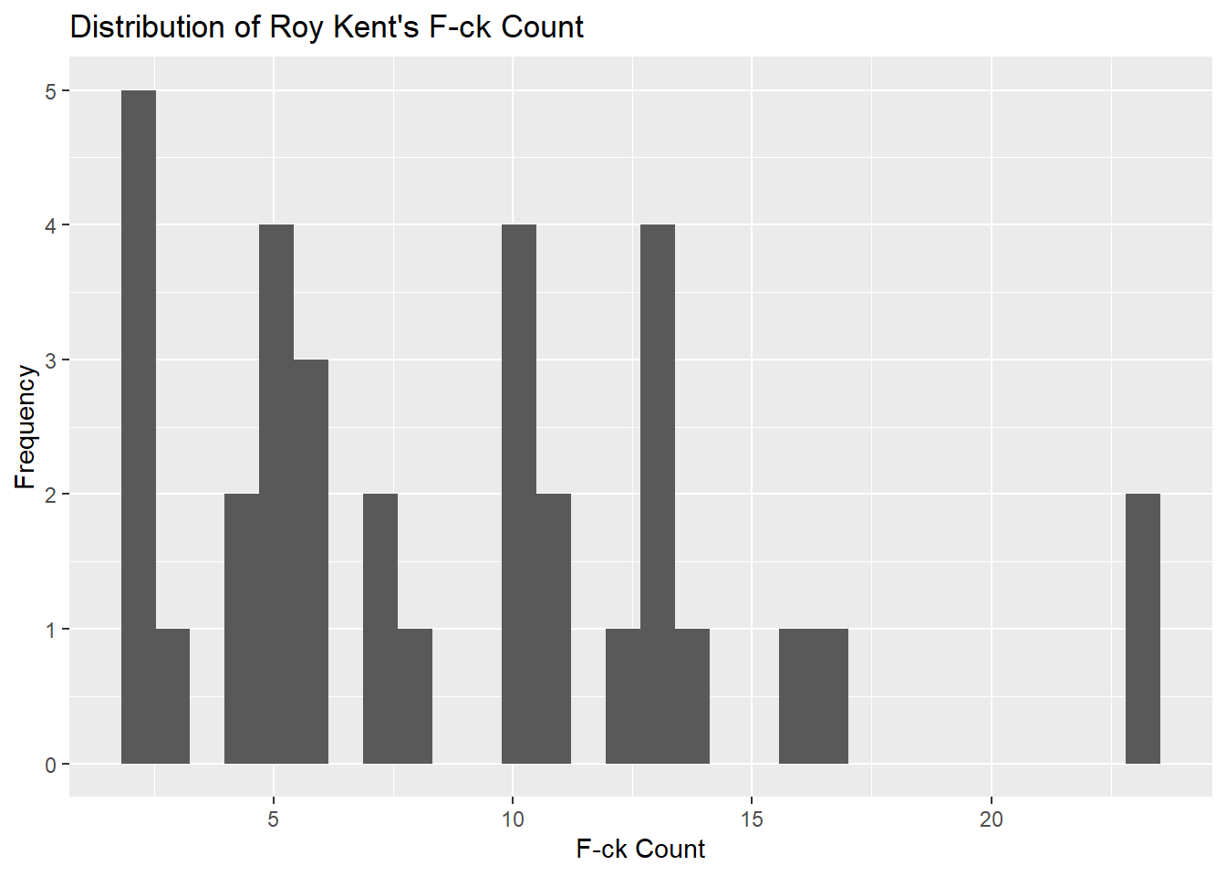
Density Plot
Density plots visualize the distribution of a continuous variable over a continuous range. Unlike histograms, these plots are smooth, which makes them suitable for estimating the probability density function of the underlying variable (Silverman, 1986). In this example, we will be using the horror_movies dataset to visualize the density of movie ratings.
Find the 5 Most Popular Languages
First, let’s find out which languages are the most popular in the dataset.
horror_movies %>%
  group_by(original_language) %>%
  count() %>%
  arrange(desc(n)) %>%
  ungroup() %>%
  top_n(5)
## Selecting by n## # A tibble: 5 × 2
## original_language n
## <chr> <int>
## 1 en 21923
## 2 es 1661
## 3 ja 1639
## 4 pt 676
## 5 de 631Filter for top languages
After identifying which languages to include, create a new data set filtered for these languages.
Create Density Plot
After filtering for the top 5 languages, a density plot is created.
ggplot(horror_movies_top_5_languages, aes(x = vote_average)) +
  geom_density(aes(fill = original_language), alpha = 0.5) +
  labs(title = "Density Plot of Horror Movie Ratings",
       x = "Rating",
       y = "Density")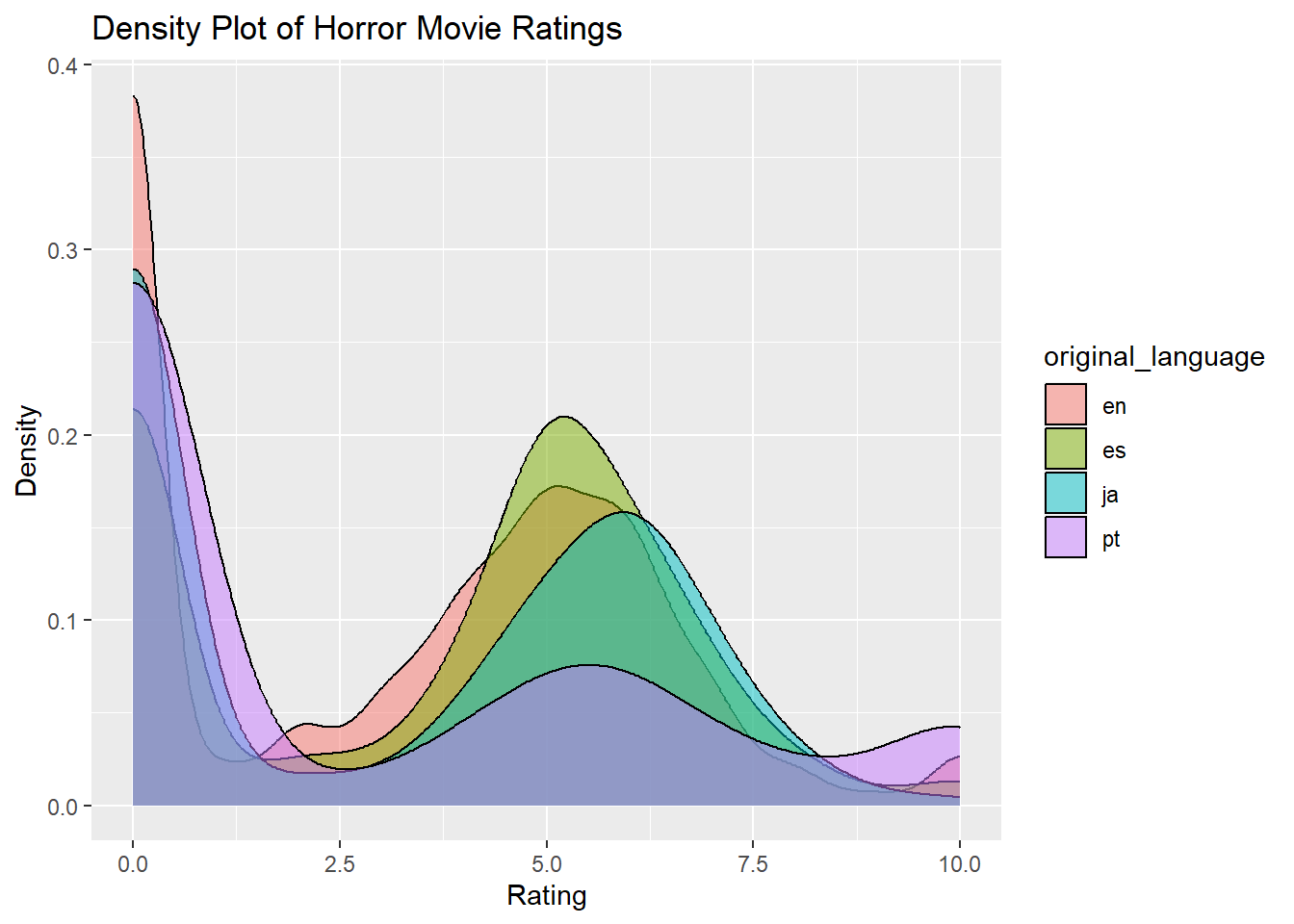
Violin Plot
Violin plots combine features of boxplots and density plots to show the distribution, median, and interquartile range of the data. They are particularly useful for comparing the distributions of multiple categories in a dataset (Hintze & Nelson, 1998). Here, we use the video_games dataset to visualize the average metascores for the top 5 publishers.
Find the 5 Most Prolific Publishers
First, we identify which publishers are most prolific.
## Selecting by n## # A tibble: 6 × 2
## publisher n
## <chr> <int>
## 1 Big Fish Games 284
## 2 SEGA 141
## 3 Strategy First 129
## 4 Ubisoft 123
## 5 Square Enix 95
## 6 <NA> 95Create Violin Plot
After filtering for the top 5 publishers, we generate the violin plot.
video_games_top_5_publishers <- video_games %>%
  filter(publisher %in% c("Big Fish Games", "SEGA", "Strategy First", "Ubisoft", "Square Enix"))

ggplot(video_games_top_5_publishers, aes(x = publisher, y = metascore)) +
  geom_violin() +
  labs(title = "Violin Plot of Average Metascore by Top 5 Publisher",
       x = "Publisher",
       y = "Average Metascore")
## Warning: Removed 572 rows containing non-finite values (`stat_ydensity()`).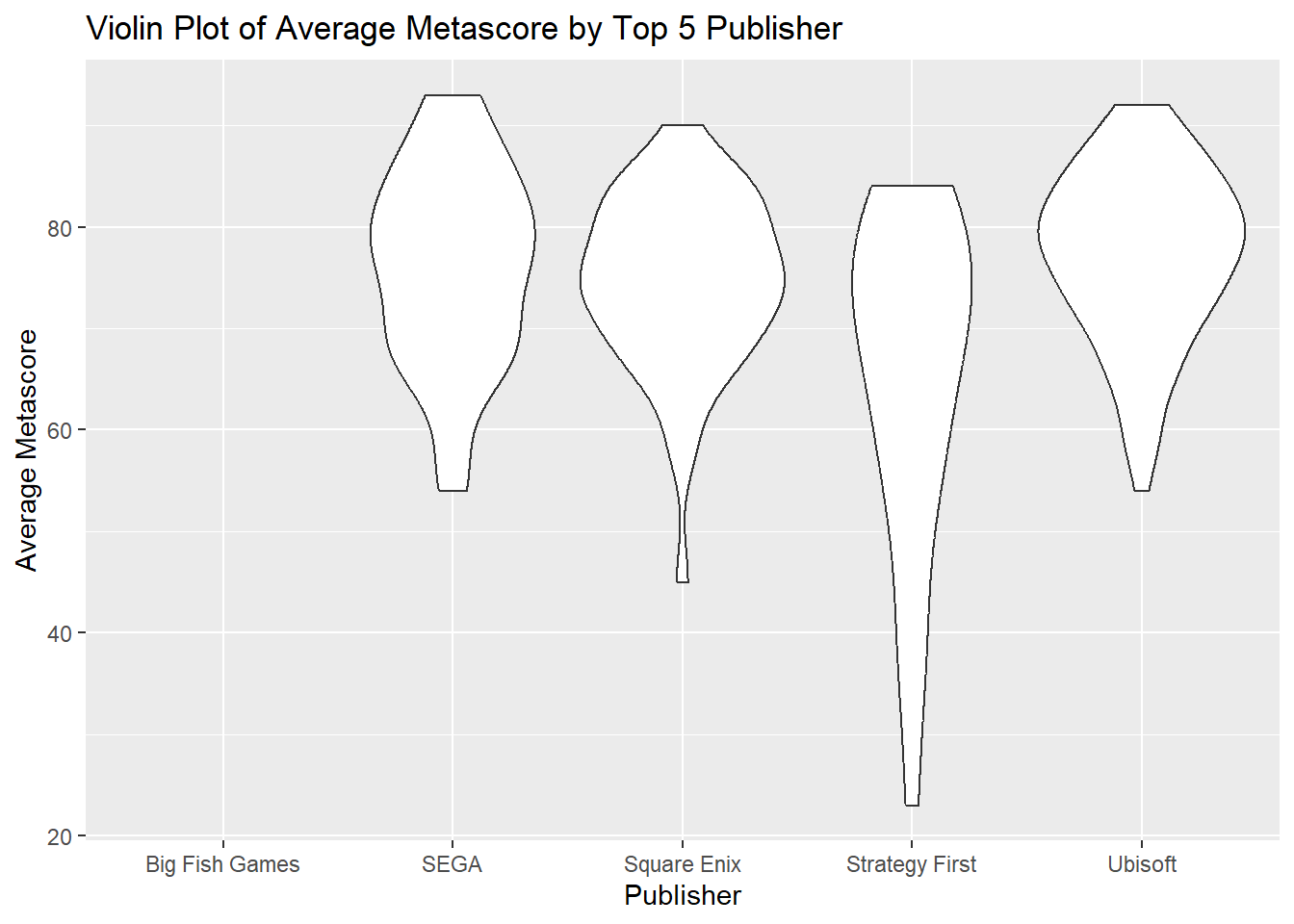
Boxplot
A boxplot provides a graphical representation of the central tendency and spread of a dataset, depicting the median, quartiles, and potential outliers. Boxplots are useful for identifying skewness and outliers in the data (Tukey, 1977). We’ll use the anime dataset to explore how scores are distributed across different types of anime.
ggplot(anime, aes(x = type, y = score)) +
  geom_boxplot(fill = "#ff00ff", color = "#770077") +
  labs(title = "Boxplot of Anime Scores by Type",
       x = "Type",
       y = "Score")
## Warning: Removed 174 rows containing non-finite values (`stat_boxplot()`).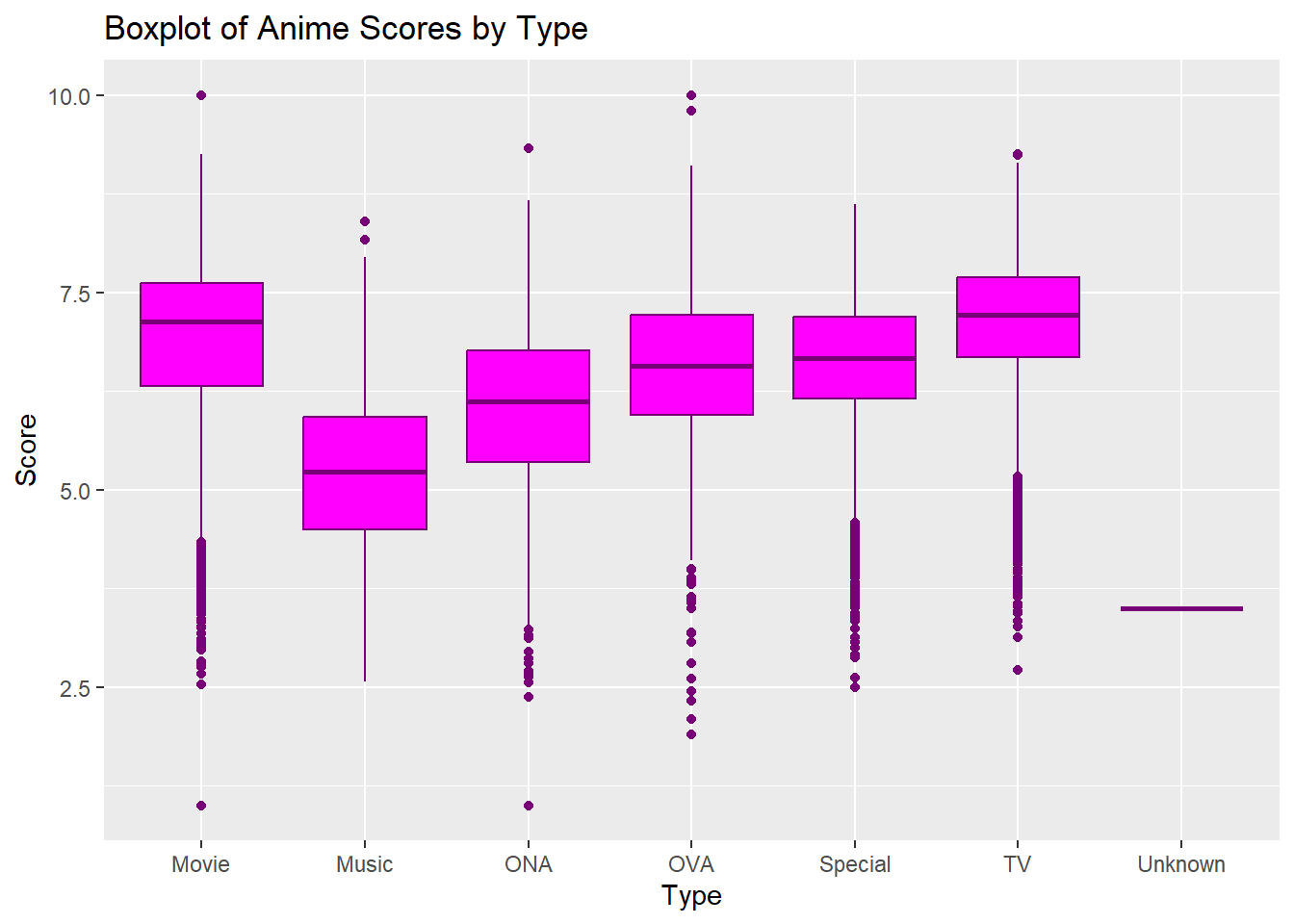
Correlation Plots
This section focuses on the use of correlation plots including scatter plots, heatmaps, and bubble plots.
Scatter Plot
Scatter plots are particularly adept at demonstrating the relationship between two quantitative variables. By plotting data points on a two-dimensional graph, they allow for the observation of patterns or correlations within the data. A scatter plot utilizes Cartesian coordinates to display values of two variables, one plotted along the x-axis and the other plotted along the y-axis. It is commonly used to observe and show relationships between two numeric variables (Cleveland, 1994). In this example, we are using the richmondway dataset.
Convert Seasons to Factor
It’s common practice to convert categorical variables to factors when plotting in ggplot2.
Create Scatter Plot
We then proceed to create the scatter plot.
ggplot(richmondway, aes(x = F_count_total, y = F_count_RK)) +
  geom_point(aes(color = Season), size = 3) +
  theme_minimal() +
  labs(title = "Roy Kent F-ck Count by IMDB Rating",
       x = "Total F-ck Count",
       y = "F-ck Count")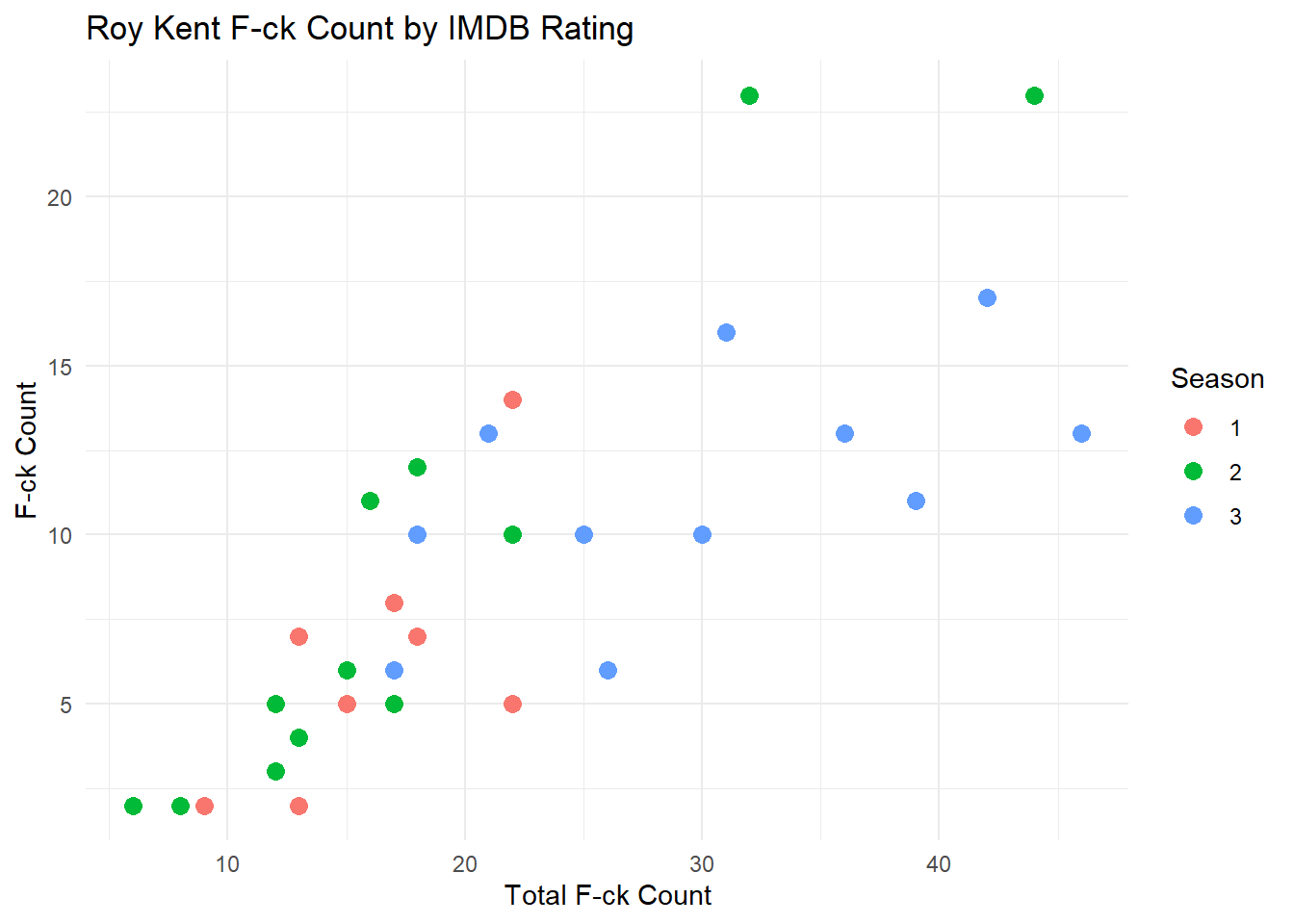
Connected Scatter Plot
A connected scatter plot combines elements of both scatter and line plots to visualize the relationship between two variables while emphasizing the sequence or progression of data points. Unlike a traditional scatter plot that only displays individual data points, a connected scatter plot links these points with lines, highlighting the order or trend of the data. This method is particularly useful when tracking the progression of two variables in relation to each other over time or categories, and it can reveal patterns that might not be evident in a standard scatter plot. A line plot, on the other hand, typically focuses on showing a trend or change in a single variable over time or categories and is more straightforward in depicting time series data. Line plots are invaluable in data visualization for their ability to illustrate trends and changes over time. The connection of data points with a line makes it straightforward to track progressions or declines within the dataset.
In the following example, we will use the richmondway dataset to create a connected scatter plot. The aim is to plot the average F_count_total for each season, showing how this average changes from one season to the next.
Average F_count_total by Season
First, we need to compute the average F_count_total for each season. This will ensure that each season is represented by a single data point in the plot.
Create Connected Scatter Plot
Now, we create the connected scatter plot using ggplot2. This plot will show the average F_count_total for each season and connect these averages to illustrate the trend over the seasons.
ggplot(richmondway_avg, aes(x = Season, y = Avg_F_count)) +
  geom_point(aes(color = Season), size = 3) +
  geom_line(aes(group = 1), color = "blue") +
  theme_minimal() +
  labs(title = "Average F-ck Count Across Seasons",
       x = "Season",
       y = "Average Total F-ck Count")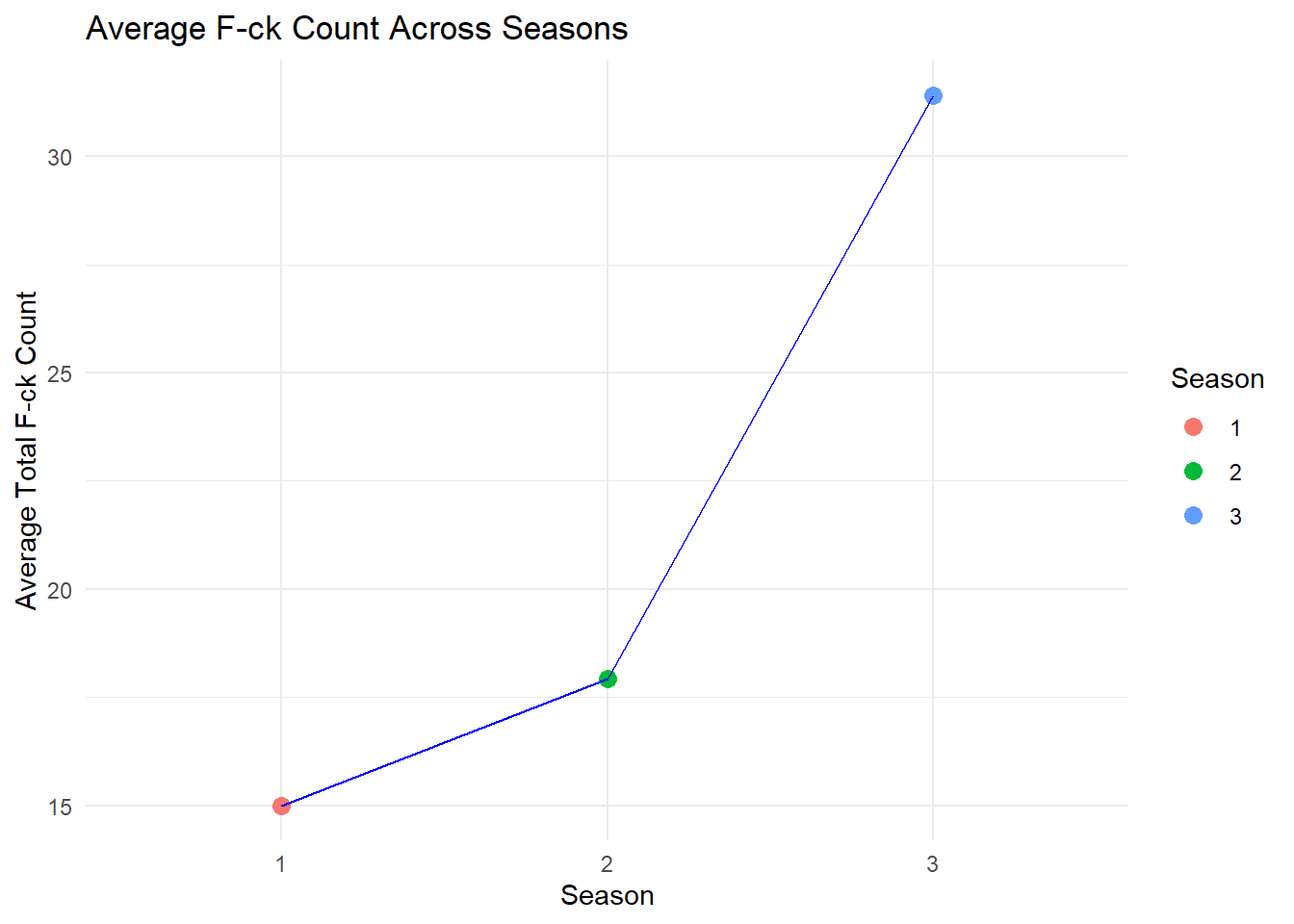
In this connected scatter plot, each point represents the average total count of a particular term (in this case, “F-ck Count”) for a season. The lines connecting these points demonstrate the progression or trend of this average over the seasons, providing a clear visualization of how the average count changes from one season to the next. The use of different colors for each season can further aid in distinguishing the data points, enhancing the overall understanding of the trends displayed.
Heatmap
A heatmap is a data visualization technique that represents the magnitude of observations as color in a two-dimensional plane. This plot is often used to understand complex data structures and correlations between multiple variables (Wilkinson & Friendly, 2009). In this example, we use the horror_movies dataset.
correlation_matrix <- cor(horror_movies[,c("popularity", "vote_count", "vote_average", "budget", "revenue")], use = "complete.obs")
ggplot(melt(correlation_matrix), aes(x=Var1, y=Var2)) +
  geom_tile(aes(fill=value), colour="white") +
  scale_fill_gradient(low="white", high="blue")
## Warning in melt(correlation_matrix): The melt generic in data.table has been
## passed a matrix and will attempt to redirect to the relevant reshape2 method;
## please note that reshape2 is deprecated, and this redirection is now deprecated
## as well. To continue using melt methods from reshape2 while both libraries are
## attached, e.g. melt.list, you can prepend the namespace like
## reshape2::melt(correlation_matrix). In the next version, this warning will
## become an error.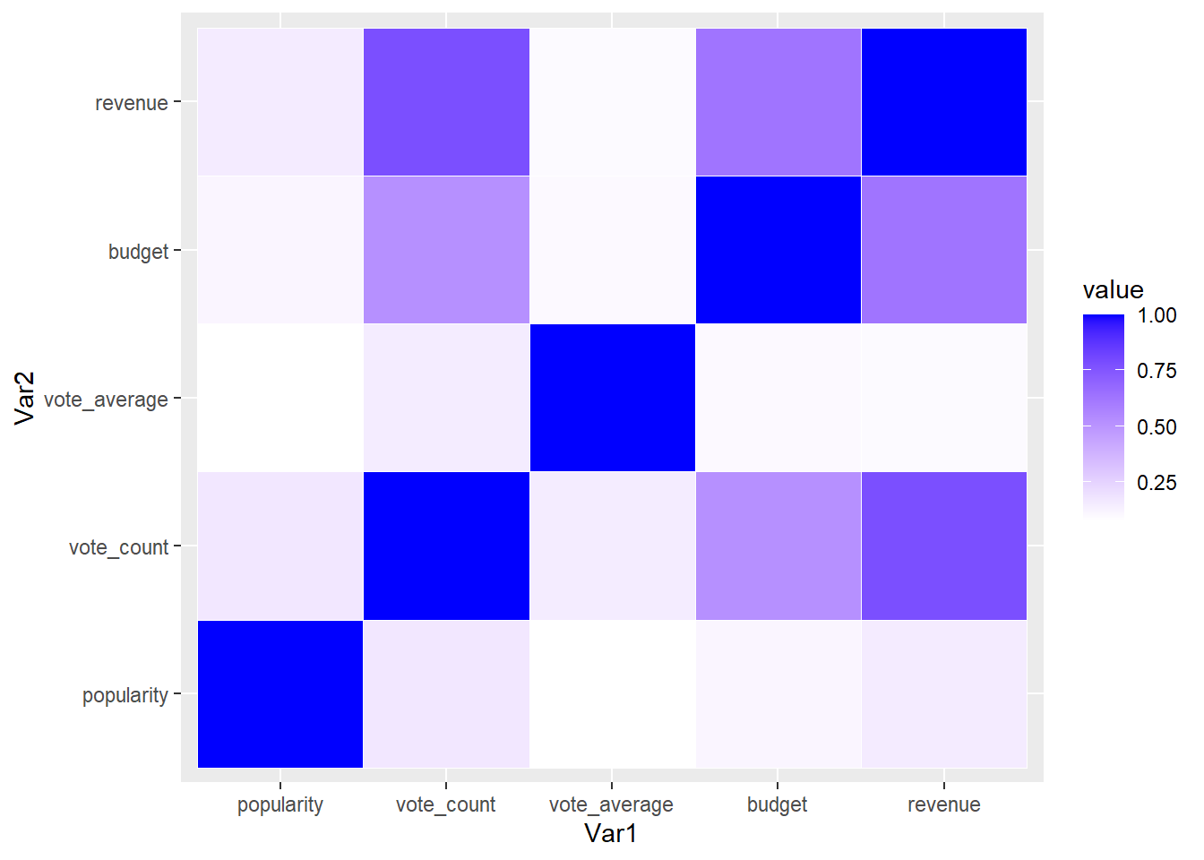
Bubble Plot
A bubble plot is an extension of the scatter plot, where a third dimension of data is added through the size of the bubbles. This allows for the simultaneous comparison of three variables (Cleveland, 1994). We use the video_games dataset in this example.
14.5.0.0.2 Remove Free Titles and Titles with Missing Data
First, we remove the rows with missing values and rows where any column has a 0 value.
Create Bubble Plot
We then proceed to create the bubble plot.
ggplot(nonzero_video_games, aes(x = median_playtime, y = metascore, size = price)) +
  geom_point(aes(color = owners), alpha = 0.6) +
  labs(title = "Bubble Plot of Playtime, Metascore, Price, and Ownership",
       x = "Median Playtime",
       y = "Metascore")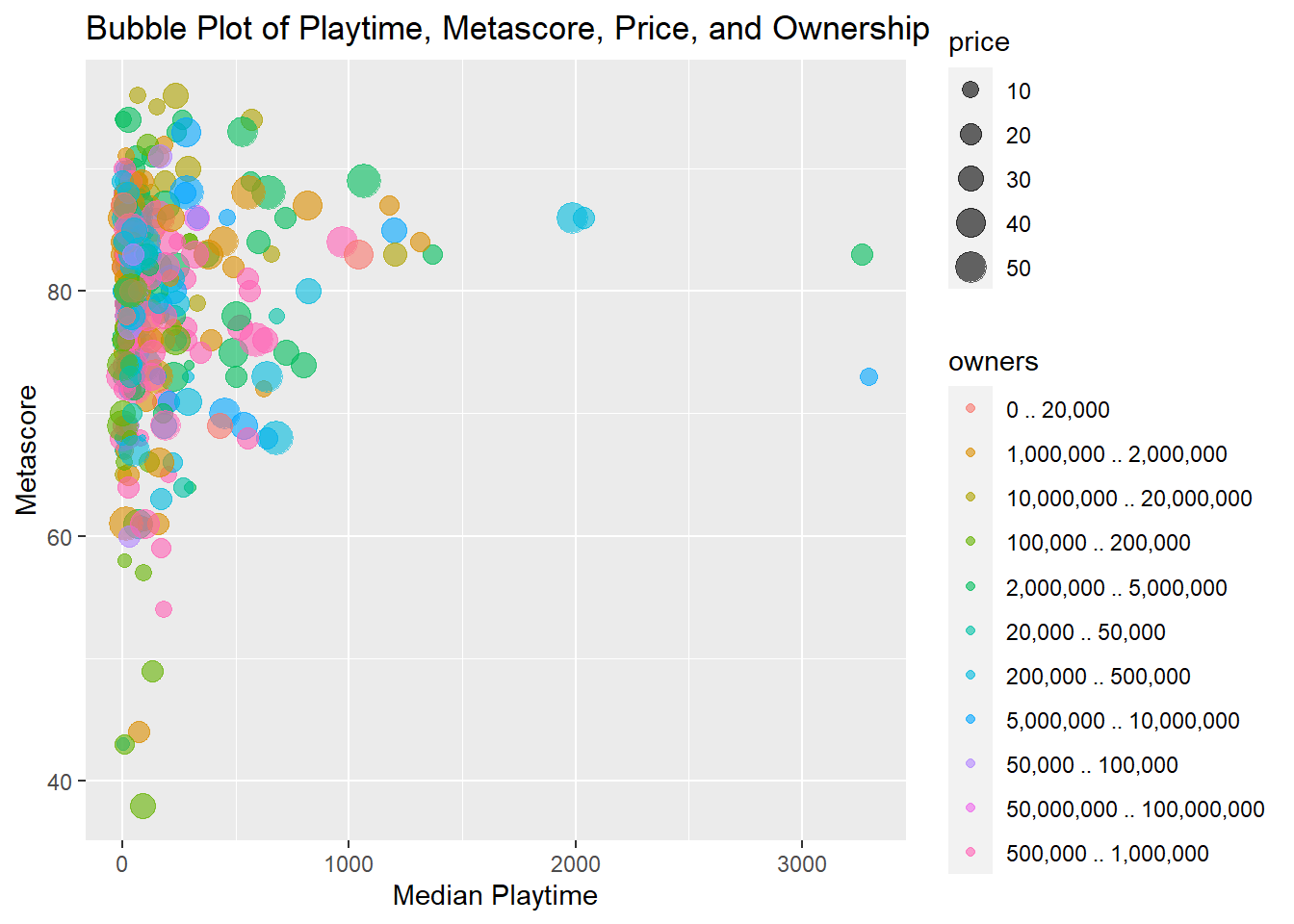
Ranking Plots
This section will cover the creation of ranking plots, specifically bar plots and lollipop plots.
Bar Plot
Bar plots represent categorical data with rectangular bars where the lengths are proportional to the counts or values they represent. Bar plots can be oriented horizontally or vertically and are useful for comparing quantities across categories (Wickham, 2016). Bar plots are preferred over line plots when the goal is to compare discrete categories or distinct groups. The segmented nature of bar plots makes them ideal for highlighting differences between items without implying a continuous sequence.
Identify Top Anime Producers
In this code snippet, we identify the top anime producers in the anime dataset.
## Selecting by n## # A tibble: 6 × 2
## producers n
## <chr> <int>
## 1 "" 16559
## 2 "TV Tokyo" 1940
## 3 "Aniplex" 1721
## 4 "Bandai Visual" 1678
## 5 "Lantis" 1630
## 6 "Movic" 1288Create a New Data Frame for Just the Top Five Producers
Here we filter the anime data to only include records from the top five producers.
Create New Data Frame with the Average Score by Producer
We then calculate the average score by producer. Note the use of na.rm = TRUE to remove NA values for an accurate mean.
Create Bar Plots
Finally, a bar plot is created using the average scores by producer.
ggplot(anime_avg_score_by_producer, aes(x = reorder(producers, -avg_score), y = avg_score)) +
  geom_bar(stat = "identity") +
  labs(title = "Bar Plot of Average Score by Producer",
       x = "Producers",
       y = "Average Score")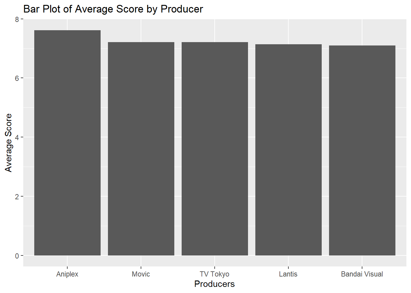
Lollipop Plot
A lollipop plot combines elements of bar plots and scatter plots to represent values of different categories. It consists of a stem (akin to the bar in a bar plot) and a dot (akin to the point in a scatter plot) at the end of the stem to signify the value (Tufte, 2001).
Separate Genres into New Rows
Assuming television is your original dataset, this code separates each genre into a new row.
# Assuming `television` is your original data frame
long_television <- television %>%
  separate_rows(genres, sep = ",\\s*")  # Separate by comma and any subsequent whitespace
Identify Top Genres
This code identifies the top 10 genres from the television dataset.
television_top_genres_list <- long_television %>%
  group_by(genres) %>%
  count() %>%
  arrange(desc(n)) %>%
  ungroup() %>%
  top_n(10)
## Selecting by n
television_top_genres_list## # A tibble: 10 × 2
## genres n
## <chr> <int>
## 1 Drama 2266
## 2 Crime 822
## 3 Mystery 558
## 4 Comedy 516
## 5 Action 387
## 6 Romance 235
## 7 Fantasy 223
## 8 Adventure 204
## 9 Thriller 160
## 10 Sci-Fi 154Create New Data Frame for Just the Top 10 Genres
Here we filter the data to only include records from the top 10 genres.
Create Lollipop Plot
Finally, a lollipop plot is created to visualize the average rating for each of the top 10 genres.
ggplot(television_top_genres_avg_share, aes(x = reorder(genres, -share), y = share)) +
  geom_segment(aes(xend = genres, yend = 0), color = "blue") +
  geom_point(size = 3, color = "red") +
  labs(title = "Lollipop Plot of Average TV Show Share by Genre",
       x = "TV Show Genre",
       y = "Average Share")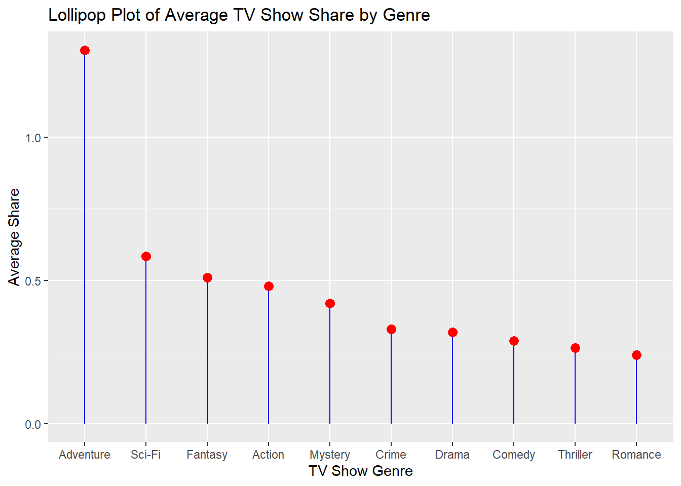
Part of a Whole
This section will cover various methods for depicting part-of-a-whole relationships in data visualization, including pie charts, grouped and stacked bar plots, and treemaps.
Pie Chart
A pie chart is a circular chart that divides data into slices to illustrate numerical proportion. Each slice represents a part-to-whole relationship (Bertin, 1983).
14.5.0.0.3 Dataset: Roy Kent F-ck count
A pie chart is created to visualize Roy Kent’s usage of the word “F-ck” across different seasons.
ggplot(richmondway, aes(x = "", y = F_count_RK, fill = factor(Season))) +
  geom_bar(width = 1, stat = "identity") +
  coord_polar("y") +
  labs(title = "Pie Chart of Roy Kent's F-ck Count by Season")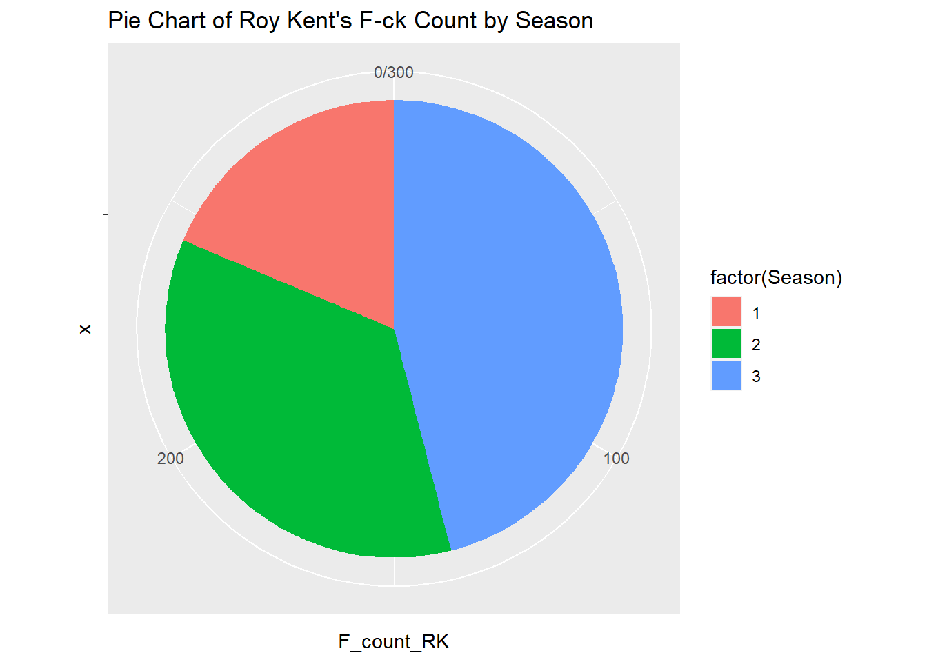
Grouped + Stacked Barplot
Create Grouped Barplot
A grouped barplot represents categorical data with multiple sub-categories. It uses adjacent bars to represent the different sub-categories within each primary category, facilitating direct comparison (Wickham, 2016). A grouped bar plot is created to show both average rating and share for each genre of television show.
ggplot(television_grouped, aes(x = genres, y = value, fill = metric)) +
  geom_bar(stat = "identity", position = "dodge") +
  labs(title="Television Shows: Average Rating and Share by Genre", y="Value") +
  theme(axis.text.x = element_text(angle = 45, hjust = 1))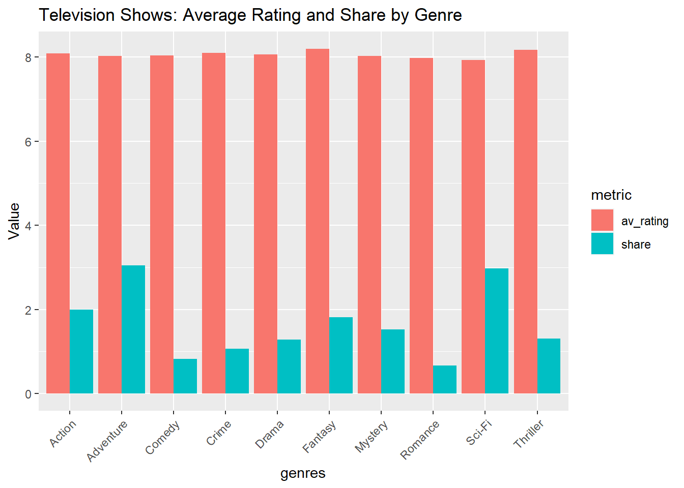
Create Stacked Barplot
A stacked barplot is similar to a standard bar plot but divides each bar into multiple sub-categories. This allows for the representation of part-to-whole relationships within each category (Wickham, 2016). A stacked bar plot is created to show both popularity and rating of horror movies by original language.
ggplot(television_grouped, aes(x = genres, y = value, fill = metric)) +
  geom_bar(stat = "identity", position = "stack") +
labs(title="Television Shows: Average Rating and Share by Genre", y="Value") 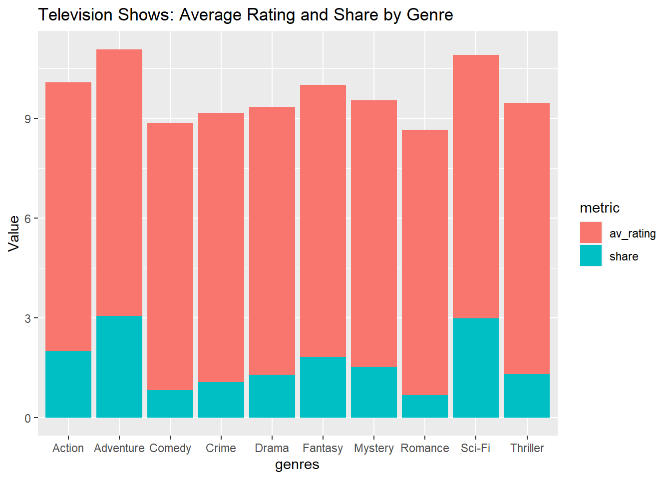
Treemap
Dataset: Horror Movies
A treemap displays hierarchical data as a set of nested rectangles. Each level in the hierarchy is represented by a colored rectangle (‘branch’), which is then sub-divided into smaller rectangles (‘leaves’) (Shneiderman, 1992). A treemap is created to visualize the vote count by original language for horror movies.
library(treemap)

treemap(horror_movies,
        index = "original_language",
        vSize = "vote_count",
        title="Horror Movies: Vote Count by Language")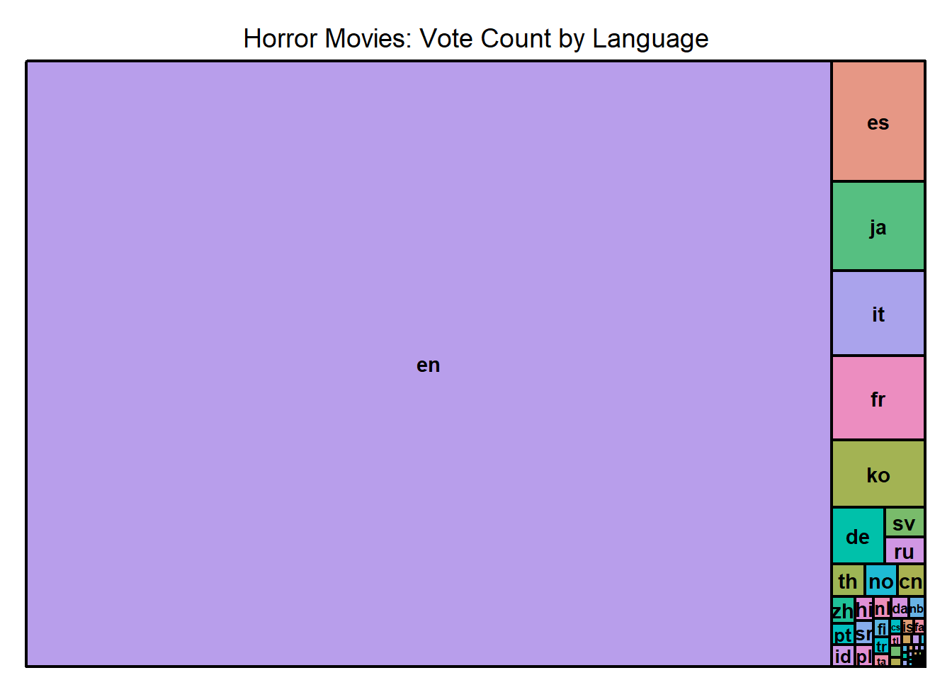
Store and Edit Plots
Filter data for unique show titles
tv_top_genres_list <- long_television %>%
  distinct(title, genres, .keep_all = TRUE) %>%
  group_by(genres) %>%
  count() %>%
  arrange(desc(n)) %>%
  ungroup() %>%
  top_n(10, wt = n)

tv_top_genres_list
## # A tibble: 10 × 2
## genres n
## <chr> <int>
## 1 Drama 868
## 2 Crime 272
## 3 Mystery 180
## 4 Comedy 177
## 5 Action 146
## 6 Fantasy 90
## 7 Romance 82
## 8 Sci-Fi 76
## 9 Thriller 74
## 10 Adventure 72You can store a plot into your environment for easier recall.
tv_genres_bar <- ggplot(tv_top_genres_list, aes(x = reorder(genres, -n), y = n)) +
  geom_bar(stat = "identity") +
  labs(title = "Bar Plot of Show Count by Major Genre",
       x = "Genres",
       y = "Number of shows")
A stored plot can be added to without having to type out all of the code if it is previously stored in the environment.
First load package with unique themes
Add to your stored plot
tv_genres_bar +
  theme_wsj()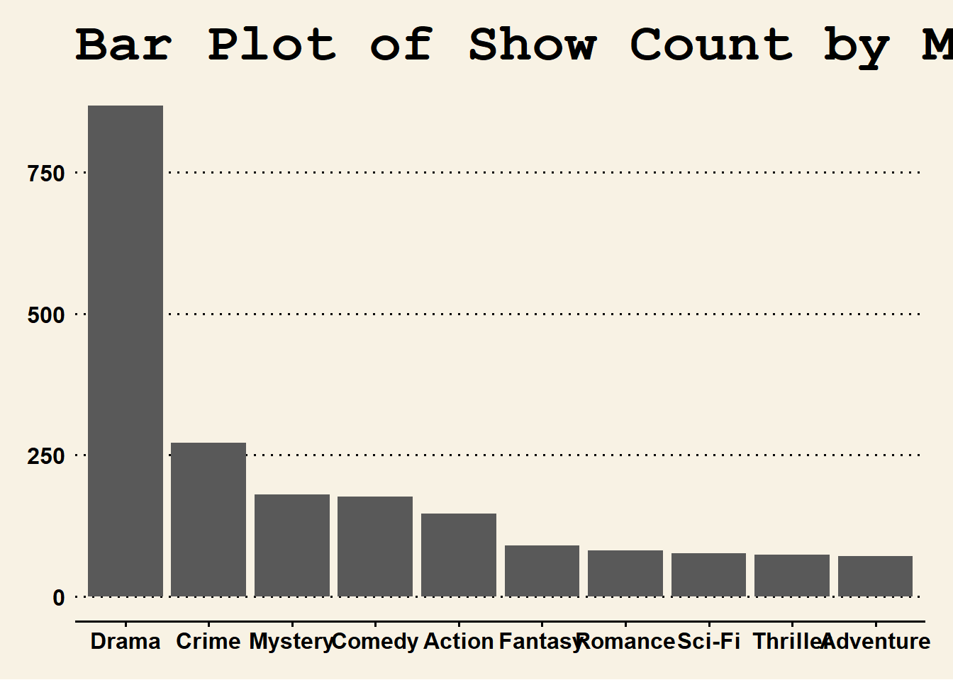
Saving Plots in R Markdown
Once you’ve generated and refined your plot, it’s crucial to understand how to save it for further use, whether for presentation, publication, or collaboration. R Markdown, together with the ggplot2 library, offers flexible ways to save your plots in various formats.
Saving Plots Directly in R Markdown
Store plot you want to save locally.
tv_genres_bar_wsj <- tv_genres_bar +
  theme_wsj()
The above chunk will save the plot in the specified directory with the name “plot_name” followed by a figure number (e.g., “plot_name1.png”).
Saving Plots Using ggsave()
The ggsave() function, which comes with the ggplot2 library, provides a straightforward way to save the last plot that you created. Below are the steps and explanations:
- PNG Format: Suitable for web applications.
ggsave("tv_genres_bar.png", plot = tv_genres_bar_wsj, width = 10, height = 5)- JPEG Format: Generally used for photographs on the web, but it’s lossy, meaning some image quality is compromised.
ggsave("tv_genres_bar.jpg", plot = tv_genres_bar_wsj, width = 10, height = 5)- PDF Format: Perfect for publications and where high quality is paramount. It retains the quality regardless of how much you zoom.
ggsave("tv_genres_bar.pdf", plot = tv_genres_bar_wsj, width = 10, height = 5)- SVG Format: A vector format suitable for web applications where scalability without loss of resolution is important.
References
- Bertin, J. (1983). Semiology of Graphics: Diagrams, Networks, Maps.
- Cleveland, W. S. (1994). The Elements of Graphing Data.
- Hintze, J. L., & Nelson, R. D. (1998). Violin Plots: A Box Plot-Density Trace Synergism.
- Shneiderman, B. (1992). Tree visualization with tree-maps: 2-d space-filling approach. ACM Transactions on Graphics, 11(1), 92–99.
- Silverman, B. W. (1986). Density Estimation for Statistics and Data Analysis.
- Tufte, E. R. (2001). The Visual Display of Quantitative Information.
- Tukey, J. W. (1977). Exploratory Data Analysis.
- Wickham, H. (2016). ggplot2: Elegant Graphics for Data Analysis. Springer-Verlag New York.
- Wilkinson, L., & Friendly, M. (2009). The History of the Cluster Heat Map. American Statistician, 63(2), 179–184.