FAVORITE BRAND
Which Brand?
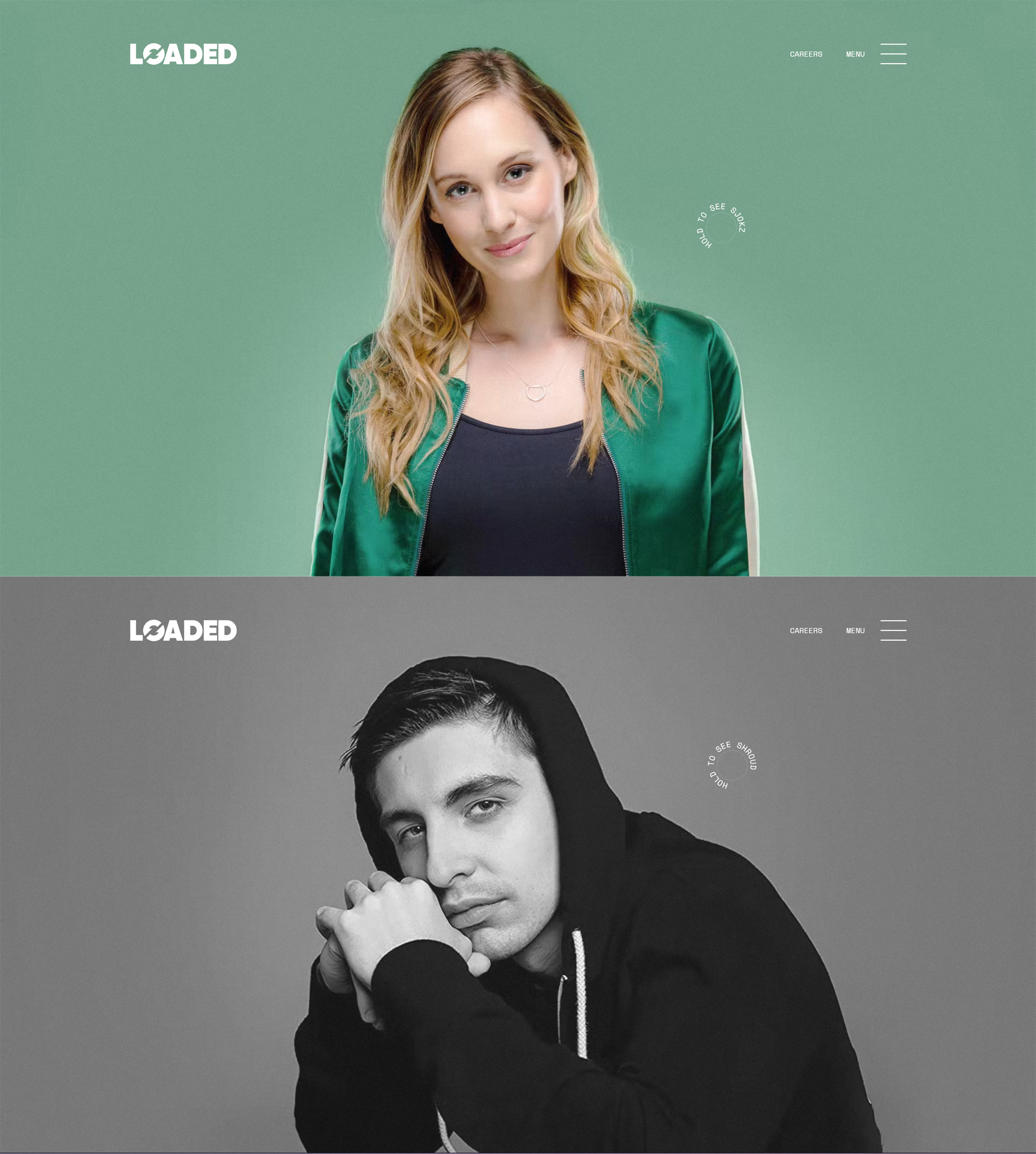
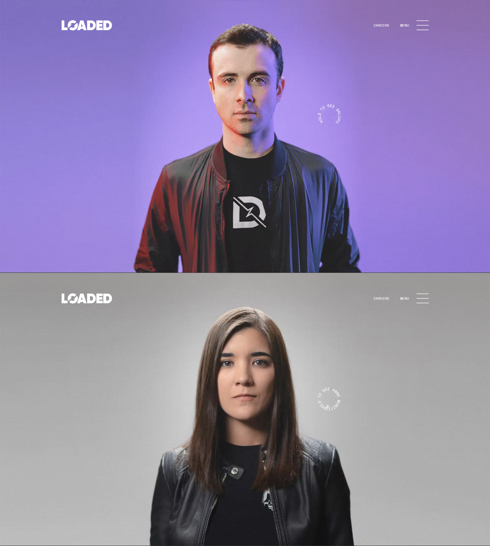
When looking through my favorite brands for design inspiration, I turned to Loaded. Loaded, otherwise known as Loaded.gg, is primarily known as a talent management for some of the most popular streamers on YouTube and Twitch. Their talent includes Shroud, a former Counter-Strike professional; CohhCarnage, a massive variety streamer; and QTCinderella, a streamer who runs large-scale events for content creators. Though this may not be a typical choice when finding an aesthetic inspiration, you can quickly tell upon arriving at the site that the content creators are the important parts of the site. When working on a site meant to serve as a portfolio, I was taken by an approach that almost forcefully pushes forward the important elements of the website.
Why Loaded?
Loaded provides a generally no-frills website. That is not to say there is nothing special. Their font choices can be mistaken for basic sanserif fonts; however, they each halve their own personality. The primary colors are black backgrounds with white text. Any variation in color comes through professional profile photos and past brand activations. Most of the professional photos include vibrant lighting and washed vintage filters. This contrast allows the content creators to stand out on the website, thus making them more appealing to potential brands that are searching for potential collaborators.
What do I Plan to Use?
I am a fan of the combination of fonts used by Loaded. Two semi-standard sanserif fonts with high weights. The font used for headers looks chunky with the high weight; the other has a bit more style. For now, I plan to use the same fonts as them as they chose Google Fonts. This makes my header font Poppins and my body font Space Mono. I also plan on duplicating the black background and white text approach. Loaded has a logo, which may have been made using the Poppins font. This is a similar approach to what I plan to take for part of the logo header.
My Logo Header
For the logo header, I plan to keep it simple and just attempt to accent the purpose of the website: writing and design examples. Therefore, I plan to keep as much white on black as possible. I will be looking for opportunities to accent with diffused versions of vibrant colors. There are a number of ways that this can occur. I haven’t yet decided on a header, but my options borrow bold cyan, magenta, and yellows to varying degrees.